Designing accessible forms
Making arguably the most pain–inducing part of the digital world less hurtful with a few simple rules.
Paper, Pain, and ADHD
I am allergic to paperwork. Forms terrify me like nothing else: although my brain craves structure, it is also terrible at following instructions in a prescribed order.
Digital forms often present a rare and exquisite kind of torture, where the end user is dragged through a series of redundant tasks in the most painful way. Who wouldn’t relate to the immensely masochistic pleasure of filling tens of fields and losing every bit of information due to a rejected password?
Internet is made of forms: from simple login screens and settings to comments, reviews, and surveys. Digital forms are used by entertainment websites, job listings, and government portals.
“The Accessibility Apprentice” reviewed a number of cases, where poorly designed forms could have costed someone their holiday or a dream job.
In this issue, we will analyse what makes a form accessible, and how to make sure your users leave your app satisfied.
What makes a form accessible?
If you search “form accessibility” in Google, one of the top results will lead you to the W3C page, which breaks down the key principles of accessible digital forms.
From labels and groups to validation and custom control, it outlines the success criteria, helps understand how accessible forms benefit people with screen readers, visitors with cognitive impairments, and other users alike.
Fundamentally, every accessible form features:
Form controls that are properly grouped and labelled;
Clear instructions for the form itself and its individual components;
Validation that provides feedback to the user, signals errors, gives instructions, etc.
Forms should give users the freedom to choose their course of action (i.e. go back and forth between sections), allow them to fix their mistakes (resubmit) and keep tabs on the progress, be convenient and simple.
On the other hand, forms should meet the engineering standards to aid their users and not hinder their progress. This concerns every user, not only those who rely on assistive tech. For instance, visitors with passwords managers will not be able to complete a mislabelled form, and customers whose input gets erased due to minor errors are more likely to abandon your product.
Designing an accessible form
Rule #1: labels
Add labels
Every field should have a clear, visible, human–friendly label: essentially, a field’s name that provides context. A good label is:
Always visible and doesn’t disappear when the user selects the field;
Clear and descriptive, but not generic: it shouldn’t confuse the user;
Separate from a placeholder and the field itself: do not place the label inside the field.

Mark required fields
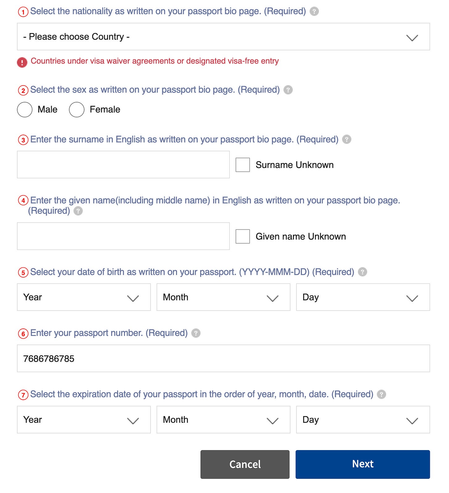
Required fields are often marked with a red asterisk, but this presents a number of challenges. For instance, if the asterisk is a part of the text, the screen reader will read it as “star”, which will obviously not help the user.
There are multiple ways to solve it. You could ask your engineers to hide the asterisk from the screen reader users, provide an alternative label for it, or even include the word “required” in the label, like Korea’s immigration authority does on their e-visa website.
Rule #2: keyboard navigation
Make sure your design system has focus states for all input fields, and ensure they work as intended. Your users should be able to complete your form without touching their mouse.
Test your form by completing it using your keyboard, and try different scenarios to identify potential challenges. How does your form react to a failed file upload? How hard is it to find a desired response in a dropdown using arrow keys? What happens if the user wants to go a step back and edit their response?
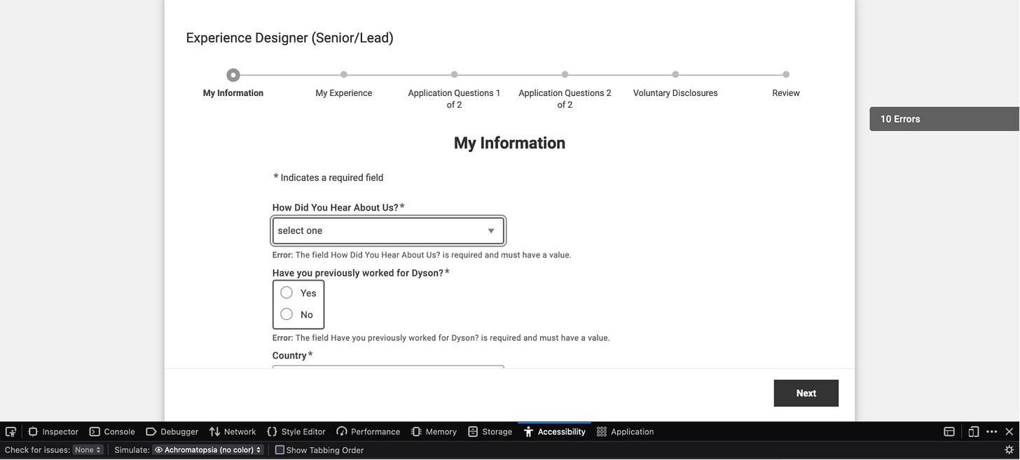
Rule #3: validation and error prevention
Communicating and preventing errors is one of the hardest tasks in designing an accessible form. Your goal is not only to notify the user that something went wrong: it is to do everything in your power to stop them from making a mistake and provide them with the means to fix it.
Your form may check the data input as the user completes it, preventing them from submitting invalid or missing information, or only trigger validation on submission.
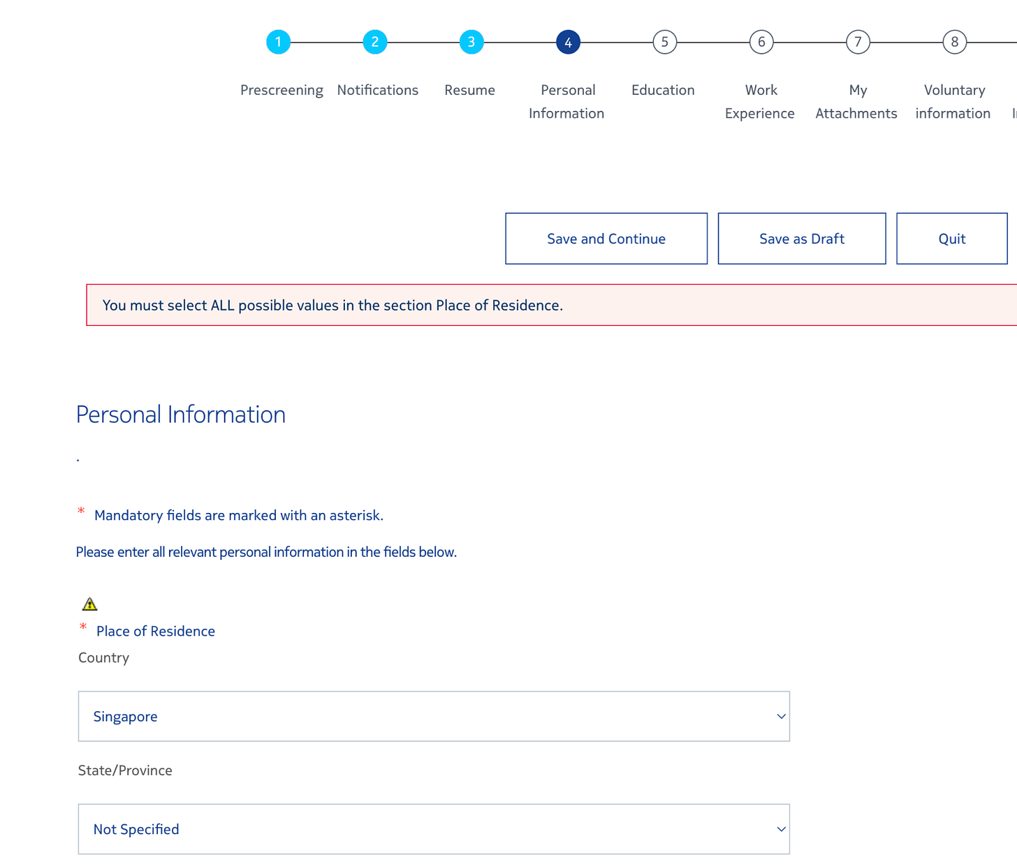
Either way, forms should not punish the user for their mistakes. Make the input field with missing or invalid data visible by highlighting it with a contrasting colour and visual aid. Avoid generic error messages (“Something went wrong” alone is hardly enough). Clearly state why the form was rejected in the first place and what the user can do to fix it.
Rule #4: cognitive load
Forms may get lengthy, and with every input field that you add, tension and anxiety will rise proportionally, eventually forcing more and more user to drop off. To avoid overloading your users, break lengthy forms into sections or pages.
It’s a good idea to indicate an approximate time to complete, but an even better idea to allow the user to jump freely between sections without losing their data.
That’s not all, folks
Accessible forms take a while to design and test, but they end up benefitting everyone, resulting in higher conversion and lower bounce rate, customer satisfaction, and increased data quality.
There are plenty of great resources on the Internet covering forms accessibility in detail. The following materials have been extremely helpful in preparing this issue:




What makes a good label: Always visible and doesn’t disappear when the user selects the field
Somebody has to say it!!