
Discover more from The Accessibility Apprentice
#06. Accessible travel: a story of one holiday.
In this issue, I share my experience applying for an online travel permit, buying a ticket, and completing an online arrival form, and review the experience.
Earlier this year, I embarked on a long and exciting trip to Uzbekistan: the country where my ancestors lived for generations. My return flight led me to Seoul, where I spent a beautiful rainy day, enjoying the nature, admiring historical sites, and munching delicious bibimbaps and tteokbokkis.
What preceded it, however, was a journey of pain and struggle. Today, I am going to walk you through the steps it took me to reach Tashkent, visit Seoul, and come back. More specifically, we are going to look into the digital services that helped me board the plane and pass immigration (twice). From the accessibility standpoint, obviously.
This is “The Accessibility Apprentice”, a free accessibility newsletter. If you want to receive more insights, teardowns, and accessibility tips in your email once every other week, consider subscribing.
Step 1: applying for K-ETA.
Verdict: 😬😬😬 not great, not terrible.
First stop, applying for a K-ETA: an electronic permit that allows you to enter Korea without a valid visa. Not sure if the naming itself is accessible: I have no clue what K-ETA stands for until this very day.
The first thing that greets you is the menu that opens on hover. A good rule of thumb prescribes items activated on hover to stay active when the mouse is moved: the Korean website, however, wasn’t as accommodating. The moment you lose focus, the navigation is long gone, and so is the active state indicator.
Where am I now? Who knows.
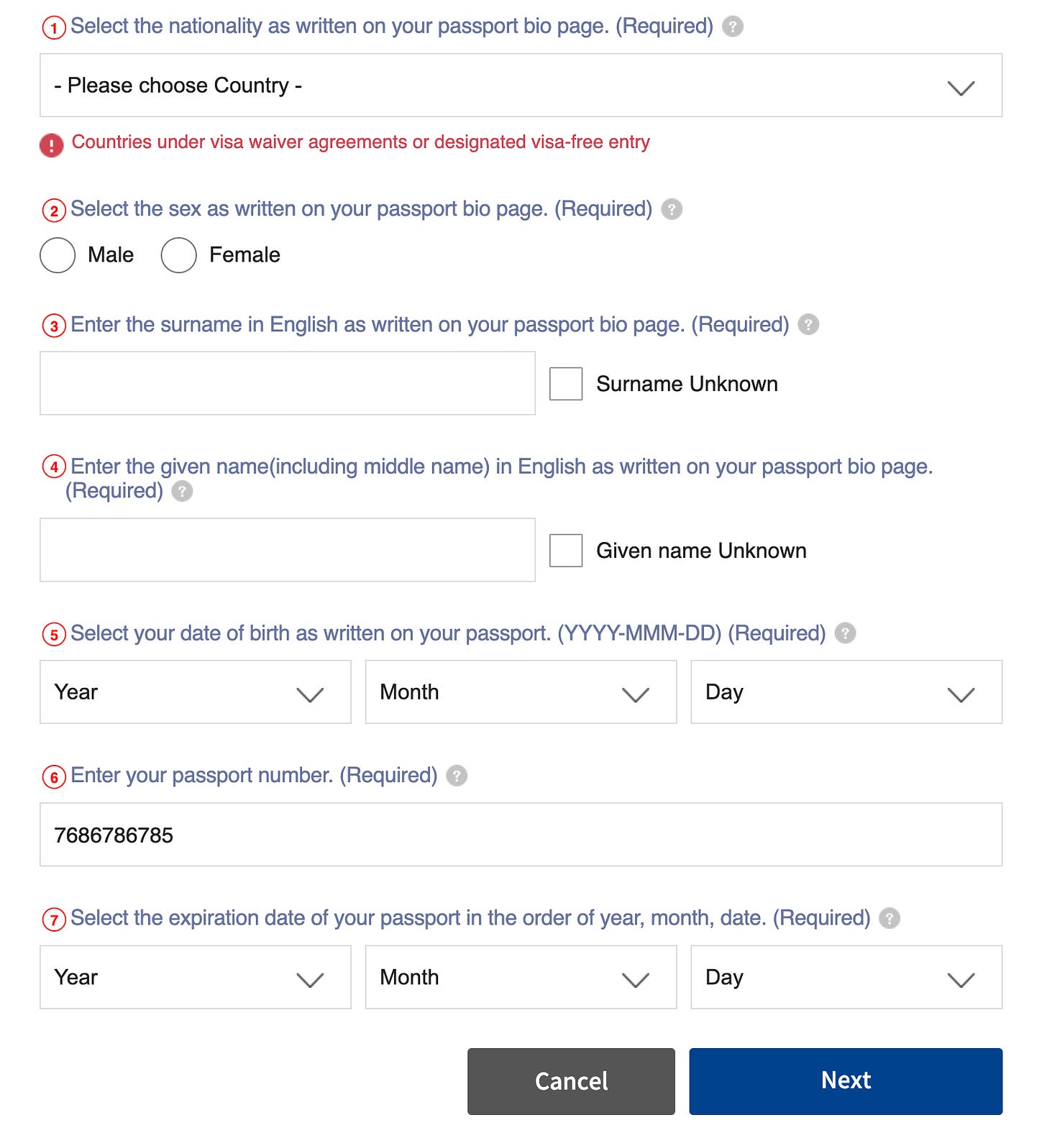
Sometimes, the form would do its best to prevent you from leaving a mandatory field blank. On certain occasions, however, it will only go as far as to inform you of an error, but won’t bother to highlight it.
Grown-ups can figure it out by themselves, apparently.
It may as well try scaring you into submission: for instance, by styling a tooltip as a warning and reminding that CORRECT input of UPPER and LOWERCASE letters is REQUIRED.
On the other hand, the form (occasionally) marks required fields as required in the label (which is a good practice). Too bad it isn’t consistent enough with this approach, but this is surely a step in the right direction.
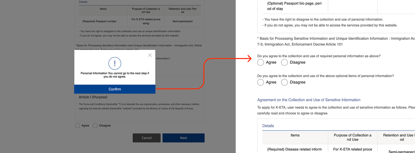
The two things that killed the joy of filling a never-ending form (just as any other individual with ADHD, I hate paperwork) were the developers blocking clipboard access and screen capture. The form would go black every time I attempted to snap a screenshot, and pasted “CLIPBOARD” when I tried entering my passport number.
Overall, the K-ETA application form was somewhat painful to complete, and left a lot to be desired in terms of accessibility. Little did I know, the worst was still ahead.
Step 2: completing an SG arrival form.
Verdict: 👍 well-done!
As a law-abiding foreign resident, I complete my arrival form exactly 3 days before arrival, so my second step was doing just that.
The immigration authority’s website welcomes you with huge buttons that are quite convenient, but could have definitely benefited from being a bit less text-heavy.
Other than that, the form is incredibly well-designed: from providing an estimated completion time to using “aria-required” attribute to mark required fields in addition to a clearly visible asterisk.
Even an email field is accompanied by a note reading that “the email address is automatically set in uppercase format for clarity purpose”, warning the user to not panic when their text input is automatically transformed.
The form itself is short, responsive, and is very-well put together, making sure anyone can easily complete it in no time. After having struggled with the K-ETA application, this felt like a breath of fresh, accessible air.
Step 3: buying a ticket with Uzbekistan Airways.
Verdict: 😡😡😡 so much pain.
A series of unfortunate events made me change my plans and forced me into purchasing a new ticket: this time, directly from Uzbekistan Airways. I went onto their website: a shiny new piece of tech befitting a proud national airline. Then, I had a closer look.
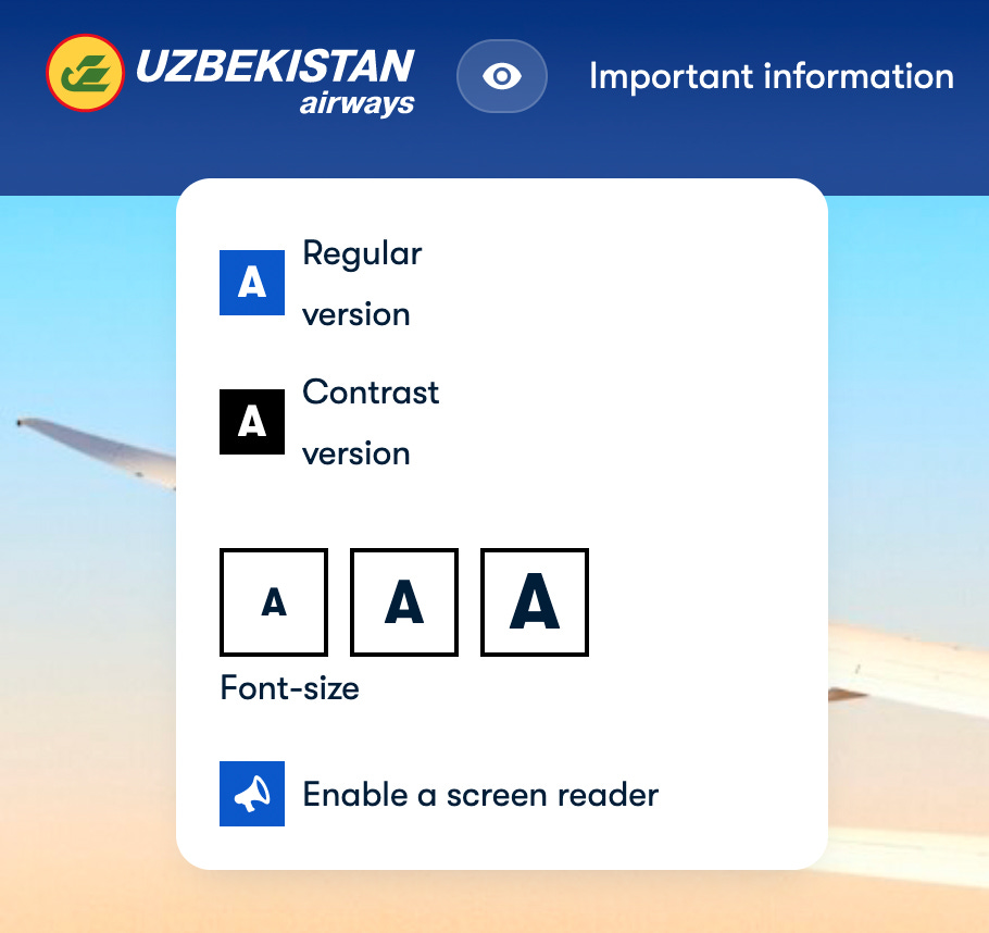
The first thing I noticed (beside an extremely confusing double language selector, where Arabic was accompanied by a Saudi-Arabian flag, an Israeli flag somehow led to a version of a website in Yiddish) was an accessibility menu (which in and of itself isn’t a great thing to be put on a website).
An unfocusable, unlabelled accessibility menu, hidden under an open-source vector version of an Illuminati eye.
Unsurprisingly, the menu wouldn’t even bother telling which font size is active now, nor will it change all text sizes across the website: the main navigation, for instance, keeps its original font size regardless.
If you were wondering what a “Contrast version” is, it simply appends filter: grayscale(1) to the body style.
Finally, toggling a screen reader setting prompts the user with a modal window. In Russian.
Things only get worse from here. Non-existent focus states making keyboard navigation impossible, menu activating on hover, primary CTA failing AA contrast standards: despite its shiny front, the website is a definition of a broken experience.
For instance, how do you like this bit: on the left, there is a card with the flight information; on the right, a toggle switching the departure time. Take a second to process it: in order to choose a different flight, you need to tap the checkbox (a radio button, really) in the sidebar.
By the time I was done, my will was broken, my soul utterly destroyed. Having spent half an hour battling a system, I cannot imagine a less tech-savvy person, let alone someone relying on assistive technology, completing their task without a problem.
Beautiful products are usable, and accessible products are beautiful. No matter how shiny your new tech is, how snappy the back-end systems are, or how great your new fonts looks on your business cards: lack of consideration for accessibility will inevitably damage your business.
I, for instance, will opt to choose another airline next time. Someone who actually cared enough to go beyond slapping an “accessibility panel” onto their website and calling it a day.
Subscribe to The Accessibility Apprentice
A biweekly newsletter that covers accessible and universal design in the digital world and beyond, accessibility audits and redesigns, tools and products. Useful, actionable tips for designers, engineers, and managers.


