

I loathe bureaucracy. Nothing shakes me as deeply and profoundly as a long form awaiting submission, be it a modern multi-paged online torture device or a good old-fashioned piece of paper peeking from its unnecessarily thick envelope. Each time I am reminded of the unavoidable duty of filling up a form, I cannot help but imagine a dark, mouldy basement of a Transylvanian castle (or, perhaps, The Castle) where a team of Vogons cackle and giggle as they come up with new exquisite ways to make paperwork even more unbearable.
If you are curious about accessibility and want to find out how screen readers work, make sure to attend my free online workshop on 31 Aug.
I hate forms, which is unfortunate, because there is nothing quite as essential to our modern living as a form. Form is the backbone of our systematised, structured communication, the ultimate tool for engaging with actors and institutions, and the near-perfect representation our constructs. Emails and instant messages enable direct communication. Application forms create new relationships (new jobs, contracts, permits) and entice introspection (forcing the applicant to fit “inside the box”). Login forms tell a bit about security architecture (is 2FA enabled?). Forms reflect how organisations and individuals think about themselves and about one another and the significance they assign to particular things. Forms are everything.
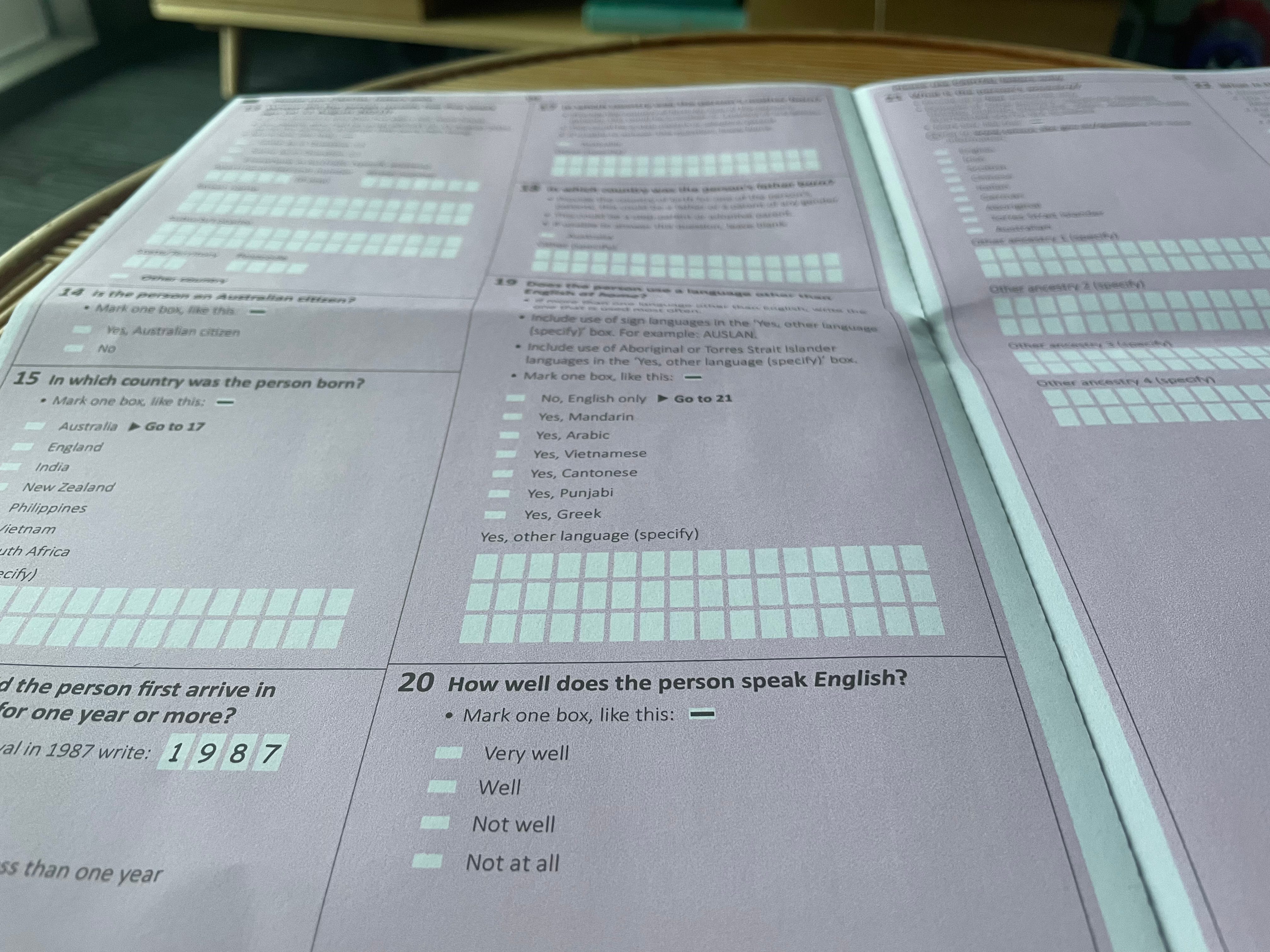
Accessibility is particularly critical in forms. Errors emerge with every vague instruction, every poorly conveyed requirement, every peculiarly arranged field group. Each error is a prospective customer drifting towards a competitor, a holiday disrupted by a needlessly convoluted immigration form, a large sum of money transferred to a wrong account by mistake. Accessible forms, on the other hand, are designed to predict, prevent, and mitigate errors, make sure that temporary setbacks do not turn into permanent blockers, and create opportunities for communication, conversion, and exchange.
#06. Accessible travel: a story of one holiday.

Earlier this year, I embarked on a long and exciting trip to Uzbekistan: the country where my ancestors lived for generations. My return flight led me to Seoul, where I spent a beautiful rainy day, enjoying the nature, admiring historical sites, and munching delicious bibimbaps and tteokbokkis.
What exactly makes a form accessible, how do accessible forms benefit users, and how do they impact businesses?
To answer these questions, my team at Paper and Pain partnered with Formbricks, an open source experience management platform.
This newsletter is and will remain free, but if you’re willing to thank the author, you are welcome to buy him a cup of espresso.
Form is an HTML5 element that allows websites to receive user input. The most basic form may have as little as one text field and one button that sends form data to the server. More advanced specimens come equipped with progress bars for multi-page input, fieldsets to group input fields, and various attributes that determine how the form looks and functions. Forms are incredibly versatile and flexible, and over the years, they have evolved to allow for near unlimited customisation. Gone are the days when input fields could not be magically transformed with CSS: modern browsers happily let the user change almost every detail. This flexibility, however, is what enables errors and violations, many of which remain invisible to most users—at least at first glance.
Input control
No other element is quite as essential to a form as an input field—an interactive component that receives and validates user data. Input fields come in all shapes and sizes, from single line text fields to checkboxes and radio buttons, with most inputs comprising two basic elements—an interactive field and a label, the former being, perhaps, one of the most frequently misused form element ever.
Labels and instructions
3.3.2 Labels or Instructions (Level A)
Labels or instructions are provided when content requires user input.
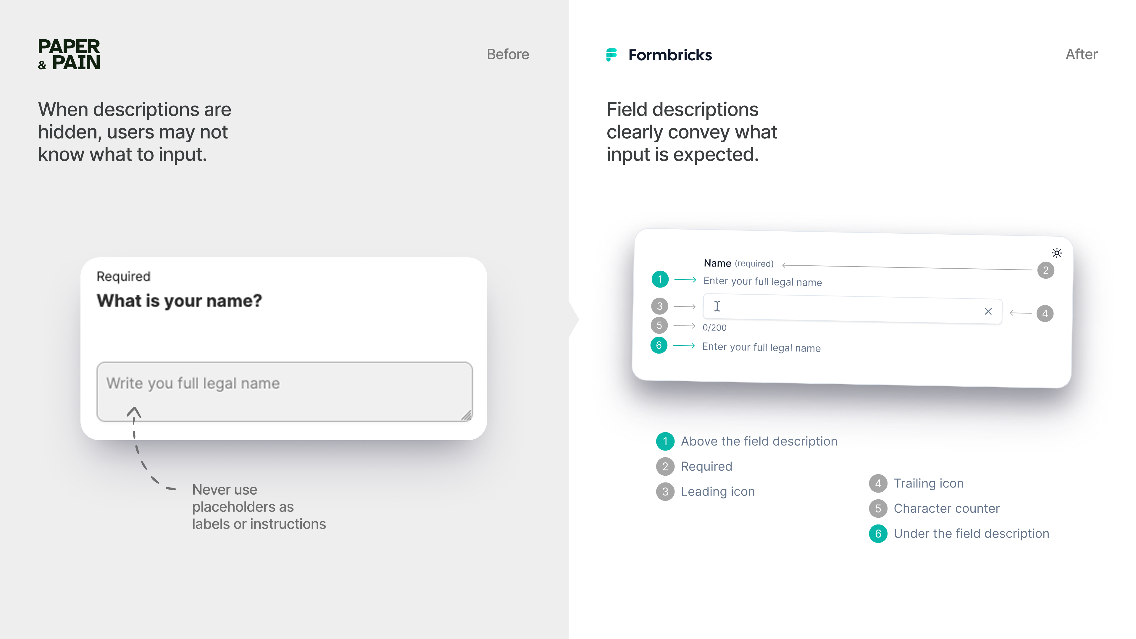
Labels and instructions help users understand what input is required of them, and therefore, must accompany every input field. This hasn’t always been the case: while forms were first introduced in the HTML 2.0 specification in 1995, labels did not appear until 2 years later, making their debut in 1997 with the HTML 4.0 release. Since CSS specifications from 2004 to 2010 deliberately discouraged form styling in browsers, developers who wished to alter the appearance of their buttons and fields had to seek workarounds or let the browser do the heavy lifting. For over a decade, labels remained relatively untouched, persistent, and visible across the Web, albeit quite inconsistently styled across browsers, until 2014, when Material Design broke them once and for all.
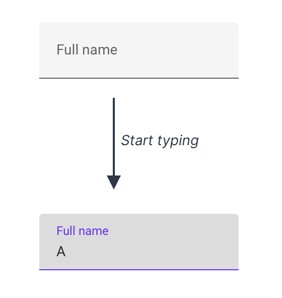
Material Design is Google’s design system language that was introduced as an effort to unify the look and feel and ease the development of Google’s web and mobile products. Among other essential elements, Material Design featured input fields, which, however, came with a twist: floating labels that were styled as placeholders and moved above user’s input. It’s not that no one had attempted to desecrate input fields prior to that: developers had been using placeholders as labels for quite some time, so persistent floating labels were, in a sense, an improvement. Unfortunately, floating labels did not evolve past their initial problematic stage, and input fields continued to degrade as more patterns began to emerge.
Visible persistent labels have many obvious advantages over floating labels and other inferior alternatives. They do not force the user to rely on short-term memory to remember what is expected of them. Unlike floating labels, they are not limited by the field’s width and can take up several lines if needed. They do not get in the user’s way—neither literally (by reducing clickable space) nor figuratively (by occupying an empty field). Paired with clear field instructions, visible labels make input fields easy to use, accessible, and aesthetically pleasing.
Focus states
If a web page can be navigated sequentially and the navigation sequences affect meaning or operation, focusable components receive focus in an order that preserves meaning and operability.
2.4.7 Focus Visible (Level AA)
Any keyboard operable user interface has a mode of operation where the keyboard focus indicator is visible.
2.4.11 Focus Not Obscured (Minimum) (Level AA)
When a user interface component receives keyboard focus, the component is not entirely hidden due to author-created content.
In 1967, Charles Kiesling, a self-taught engineer in the employ of Sperry Rand Corporation, filed a U.S. patent no. 3531796A describing a brilliant solution to a then fairly novel and relevant problem. By the mid-1960s, cathode ray tube (CRT) displays had already replaced punch cards, but computers still lacked the means to identify user’s position in the interface. Kiesling’s invention—a blinking cursor—was a simple and intuitive way of marking the insertion point to help users orient themselves in the digital space, and it has remained an essential element of virtual interfaces to this day.
As digital interfaces and input methods continued to evolve, new means to convey user’s position and focus were necessary. In 1998, the CSS2 specification introduced a new and expanded list of dynamic pseudo-classes—:hover, :active, and :focus—which allowed website elements to change appearance in response to users pointing at, activating, or focusing on them. Focus state was a new and particularly important innovation: a spiritual successor to the blinking cursor in the world dominated by computer mice, it allowed keyboard users to move between elements with ease. The same specification introduced outlines—styles that allowed developers to customise interactive elements by drawing over the element. Unlike borders, outlines did not take up space and did not influence the element’s properties: a perfect tool for highlighting buttons and fields in focus.
Unfortunately, neither web designers nor their clients at the time appreciated the innovation. Bright blue outlines disrupted the look and feel of websites, and having quickly discovered that they can be hidden with one line of code, developers unleashed the Outline-0 Plague upon the world, rendering hundreds of thousands of web pages unusable:
designers are annoyed by the fact that the focus indicator remains visible when a user activates a link and then returns to the original page
Accessibility advocates rushed to release recommendations (one, two, three) to webmasters who did not wish to retain the outlines, suggesting that they instead style the elements themselves, but the disease would only continue to spread. It certainly did not help that the outlines looked rather inconsistent across the Internet browsers: for instance, Firefox 3 added dotted outlines that matched the colour of the element’s text whereas outlines in WebKit browsers (Safari) have always been bright blue. The wide adoption of CSS reset files only made matters worse: although the infamous “outline: none” line was included to encourage developers to design their own outlines, most (if not all) chose to leave it as is.
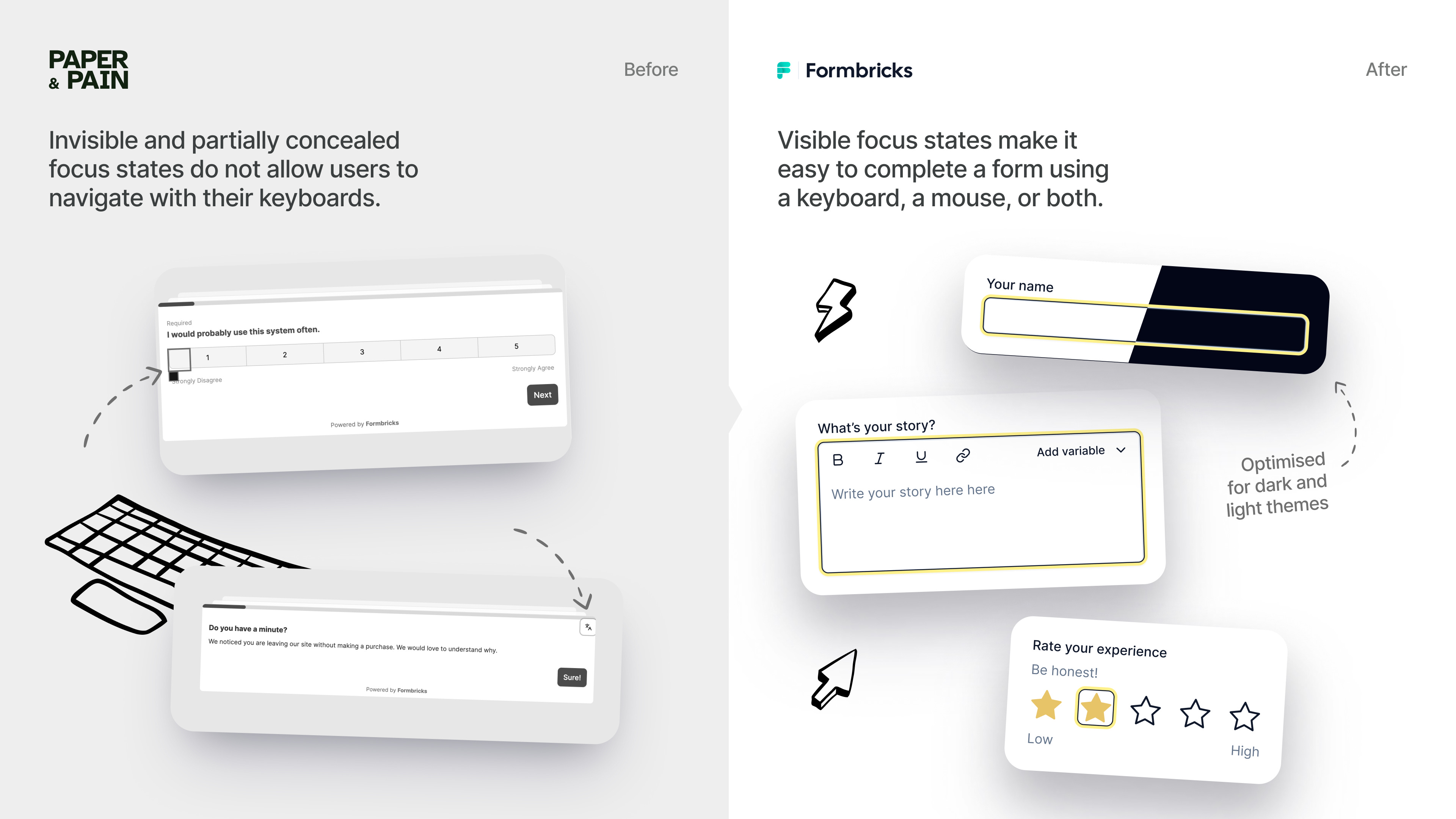
The Web today seems to have a better understanding of the significance of focus states, especially when it comes to forms. Being able to identify your current position, hop between input fields, and complete the form without touching a mouse is essential to assistive tech users as well as keyboard warriors who ditch their IDEs and GUIs in favour of a Terminal. In a world where every second counts, the time it takes to move a cursor from one field to the next is time stolen from the user and revenue stolen from the business, and good forms do not steal.
Good forms help their user locate themselves on the page among hundreds of elements, each competing for human attentions. Good forms make sure their focus states are visible, persistent, and not obscured by other elements. Good forms are intuitive in layout, composition, and focus order: shifting focus to the next element does not take their user by surprise.
Errors
3.3.1. Error Identification (Level A)
If an input error is automatically detected, the item that is in error is identified and the error is described to the user in text.
3.3.3. Error Suggestion (Level AA)
If an input error is automatically detected and suggestions for correction are known, then the suggestions are provided to the user, unless it would jeopardize the security or purpose of the content.
Abort, Retry, Fail, Ignore? If you are old enough to remember what DOS stands for, you may remember this notorious error message, often cited as one of the worst error messages of the early computer era. “Abort, Retry, Fail?” (or “Abort, Retry, Ignore?”) asked the user to take action in case of an error. If the difference between Abort and Fail is not clear to you, you are not the geek the system expects you to be: otherwise, you’d be aware that Abort exits the application and Fail returns an error message to the application and allows it to choose its response. If you don’t know what action is expected of you, you certainly do not know how the command line works and may not discover that pressing A will send an “Abort” signal to the application, R will ask it to retry, and so on. Easy, isn’t it?
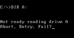
Luckily, the age of vague, horrifying, and confusing error messages is over. <ISINDEX> is long dead. No one is writing Common Gateway Interface programmes with C any more to handle user input. Applications are not designed by and for a small group of enthusiasts who happily memorise hundreds of error codes and commands. Today’s programmes are expected to acknowledge and respect the standards that have developed since the dawn of the modern Internet era, especially when it comes to handling and preventing errors.
The practice, of course, often disagrees, treating errors as an afterthought rather than an essential part of the experience.
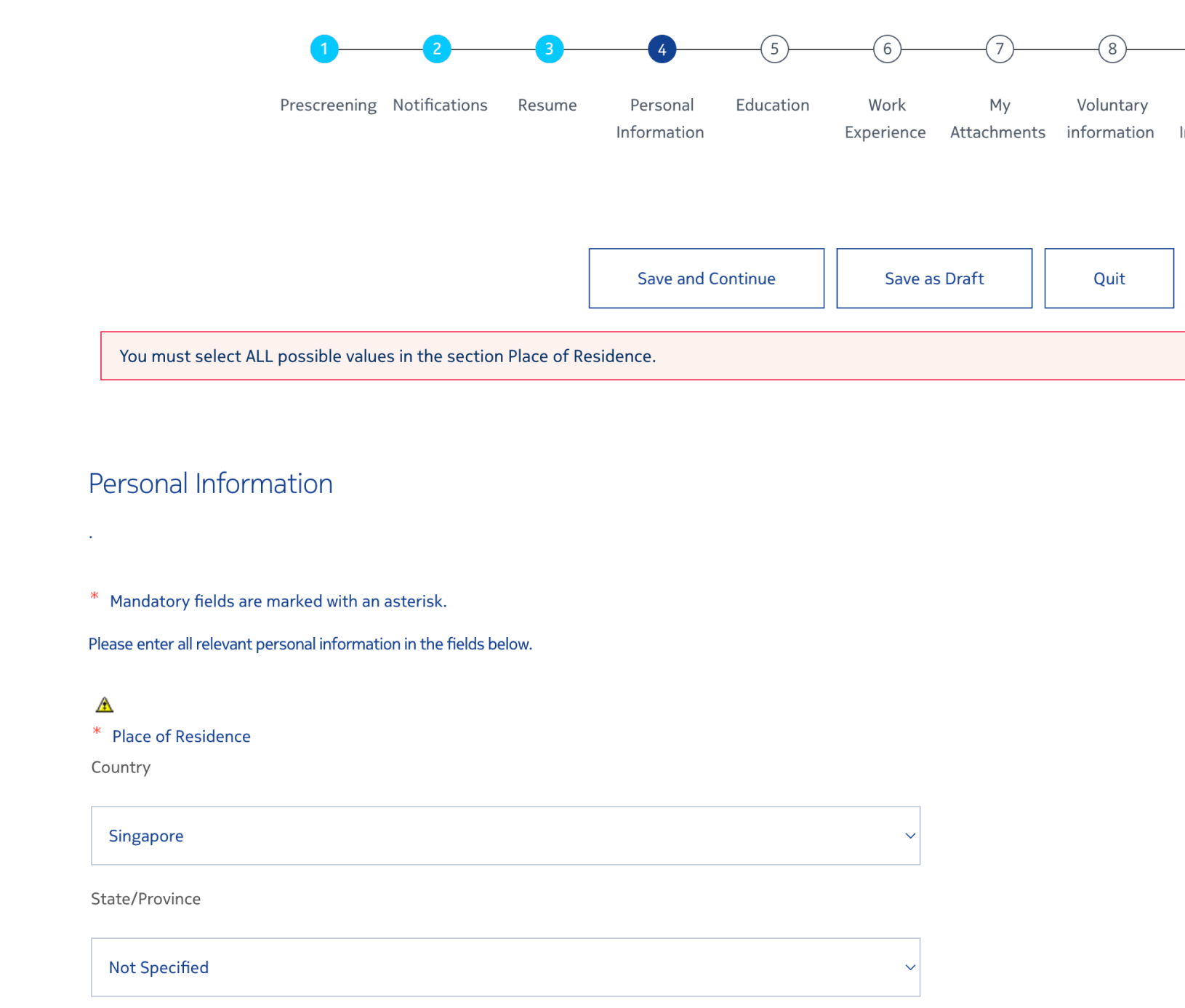
The primary purpose of an error to inform the user of the system’s state and guide them to recovery, so good error messages have to be visible, clear, and helpful. Errors are not the best way to nudge the user or suggest input: they exist to signal a validation problem, and as such, deserve a distinct look and a prominent placement.
When the form encounters an error, it should bring it to the user’s attention. Colour alone will never suffice: even though red is widely used to signal danger, colour-blind users may not be able to spot it. A good error message uses colour in combination with a noticeable highlight, an icon, or both, making a field with an error stand out. When multiple inputs are organised into a group, an error should clearly outline its scope—for example, by highlighting the entire field.
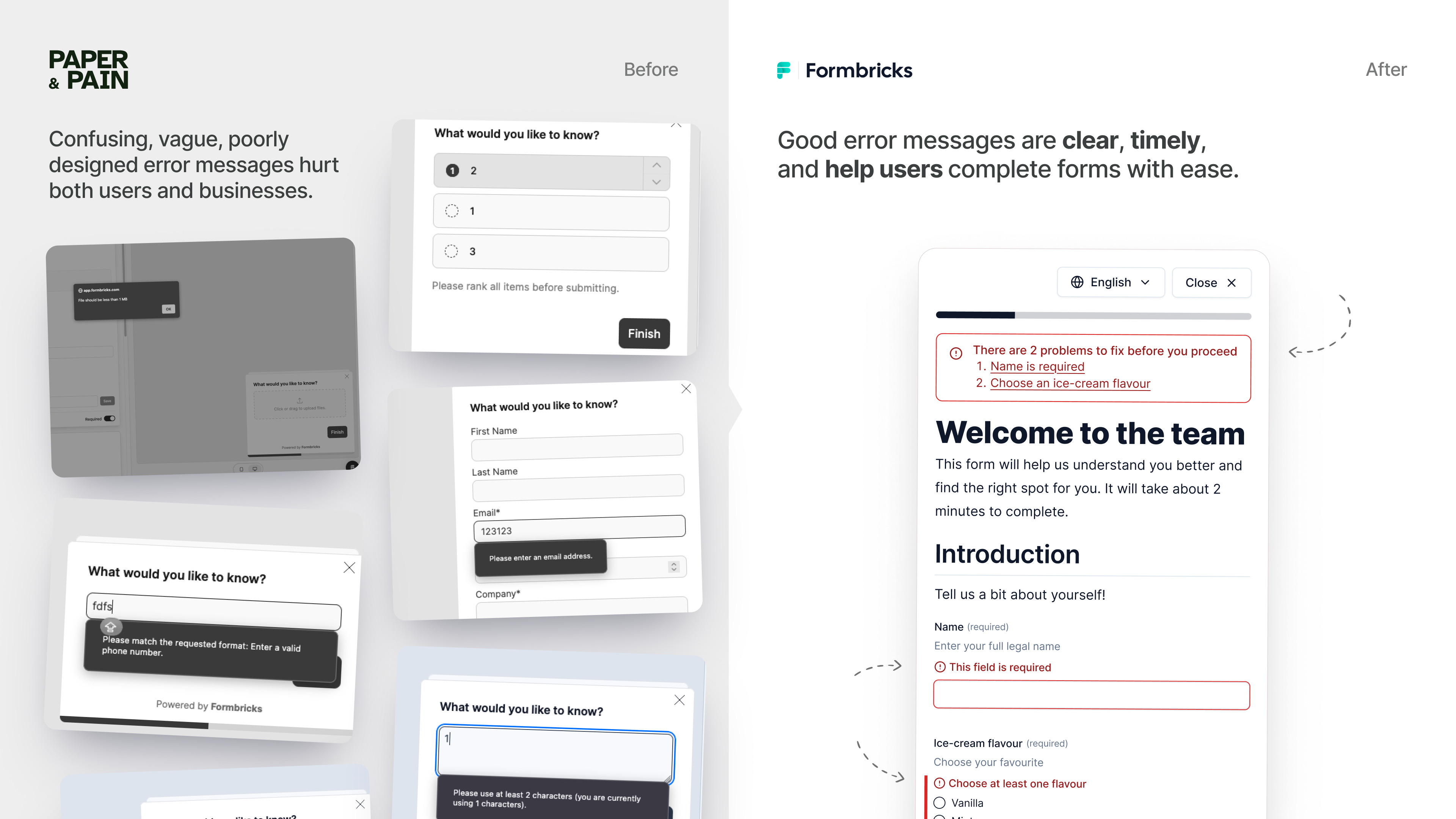
An error message itself must be clear, short, and leave no room for ambiguity. Some design systems discourage the use of certain words, such as “please” for implying choice or “sorry” for not helping resolve the problem. Others allow for more flexibility and do not forbid playful and informal language. What all mature accessible systems have in common is an appreciation for concise, well-worded error messages that provide a solution rather than highlight the problem.
Individual error messages, well-designed or otherwise, may not be enough to let the user know that their form has been returned to sender. Many products, unfortunately, rely on “toasts”—disappearing alert cards—to convey the message. Although GitHub—one of the pioneers of this despicable practice—recently decided to ban toasts citing accessibility concerns, it is highly unlikely that components named after deliciously browned slices of bread will disappear any time soon. Much like their floury counterparts, digital toasts do not tend to linger: blink, and the critical error message forever leaves your screen like a PB&J sandwich disappearing off your plate. A good way to signal a form error is with an interactive error summary: a component prominently lodged at the top of the page that contains every error and lets the user navigate straight to the problem instead of looking for the culprit themselves.
Things we don’t talk enough about
Besides logical order, focus states, and error prevention, there is a number of important considerations that go into designing accessible forms. Some of these matters are quite clear and straight-forward: for instance, aria-label should only be used when no other option is available. Some are being widely debated in the community. Should field descriptions go above or below the field? How to phrase questions on sensitive and potentially traumatising topics?
One such consideration has something to do with the ways humans communicate in writing. Early written languages did not have a fixed direction: instead, alternate lines and letters were reversed, forming what is known as boustrophedon—Greek for “like the ox turns”. Today, although the majority of languages are written in left-to-right scripts, over 215 languages use right-to-left scripts, with over a billion people writing in what English speakers would call “reverse”. Web and mobile interfaces have learnt to adapt to the user’s script in the late 1990s: for instance, HTML4 introduced the <dir> (for “direction”) attribute in 1999. Unfortunately, the availability of standards does not automatically translate into their full and proper implementation.
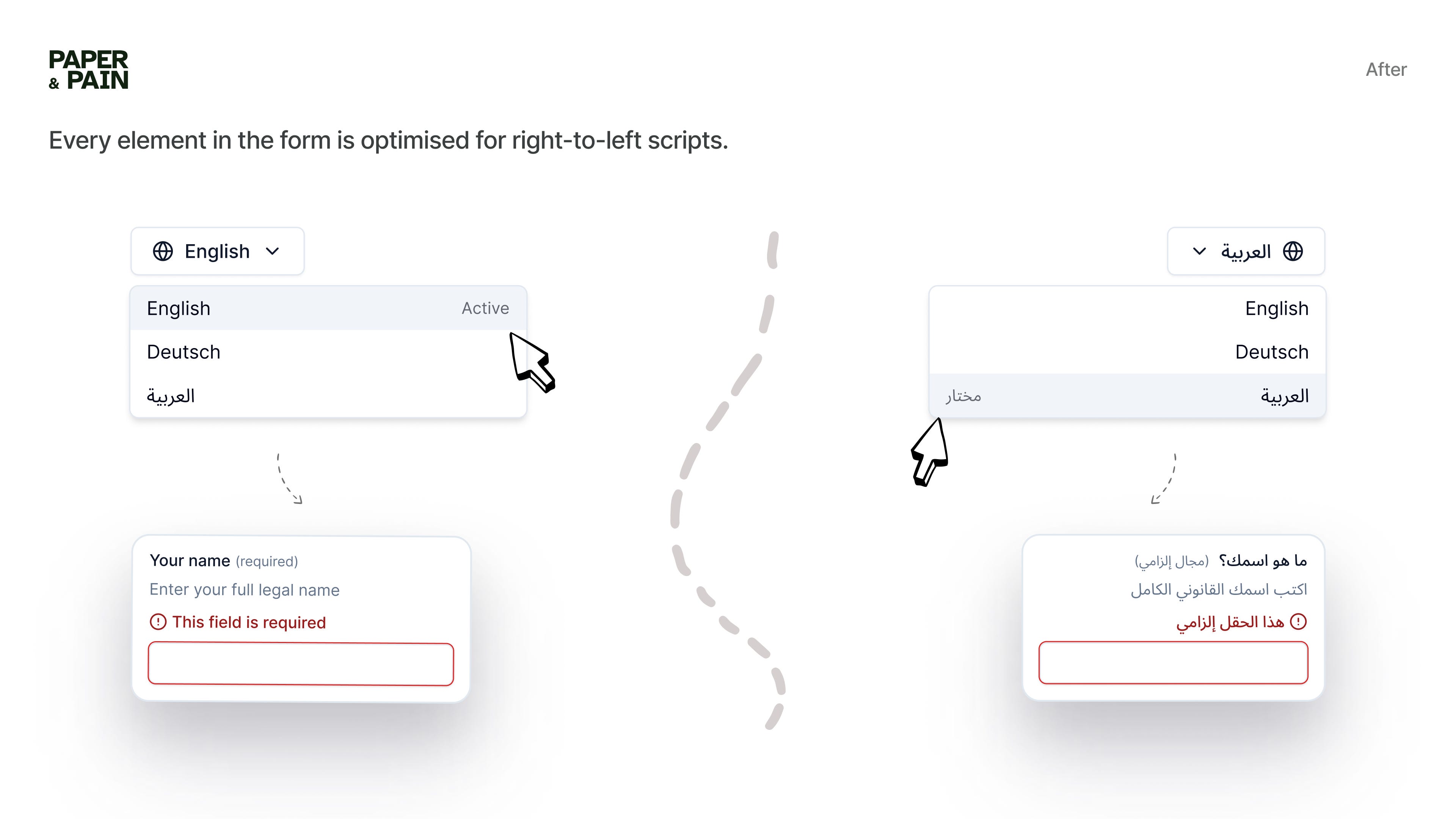
It is not enough to simply allow the text to flow from right to left. “Mirroring” the UI in its entirety will not do the job either. RTL support entails adapting the interface and respecting the user’s reading and browsing patterns: consistently aligning elements, reversing progress bars and scales, flipping directional controls, and adjusting font size. While some changes are quick and obvious, such as moving trailing icons to the left, others may pose a serious challenge: for instance, ensuring that images and graphics are displayed in the correct order. Designing a multi-language form requires attention and care that goes beyond changing the language code and flipping the interface.
What’s next
Accessibility is never done. Building accessible forms is not a straight-forward process that ends once the code is shipped. New challenges emerge as real users stumble upon unexpected barriers, as the product grows and expands, and as we develop more tools for interacting with the digital world. The journey towards building a more accessible, equitable, and accommodating Web begins with small changes—not only in how our products function but in how we view them and what we prioritise.
Standards and regulations matter only insofar as teams implementing them understand their purpose. The difference between knowledge and understanding is subtle but significant: factual knowledge is fundamental and passive, whereas understanding is an active process of thinking and interpretation. Understanding the importance of accessibility in forms design is being able to see beyond success criteria in and of themselves, to foster an inclusive and welcoming environment, empathise with humans, be curious and considerate.
Accessible forms may start with visible focus states and legible error messages, but they certainly do not end there.
Resources
Web Accessibility Initiative. Forms Tutorial.
WebAim. Creating Accessible Forms.
Vision Australia. Five Simple Tips for Designing Accessible Web Forms.
Sandrina Pereira (Smashing Magazine). A Guide to Accessible Form Validation.
Intopia. Anatomy of an Accessible Auto-Suggest.
GOV.UK Design System. Error Message (Component).
DigitA11Y. Best Practices for Creating Form Designs.