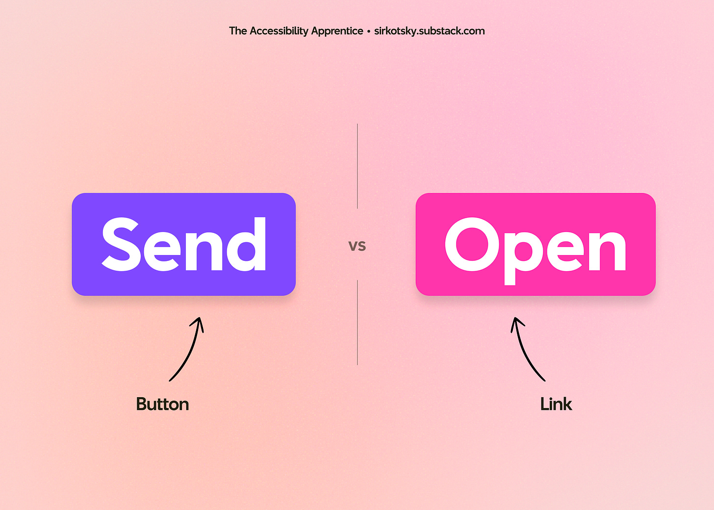
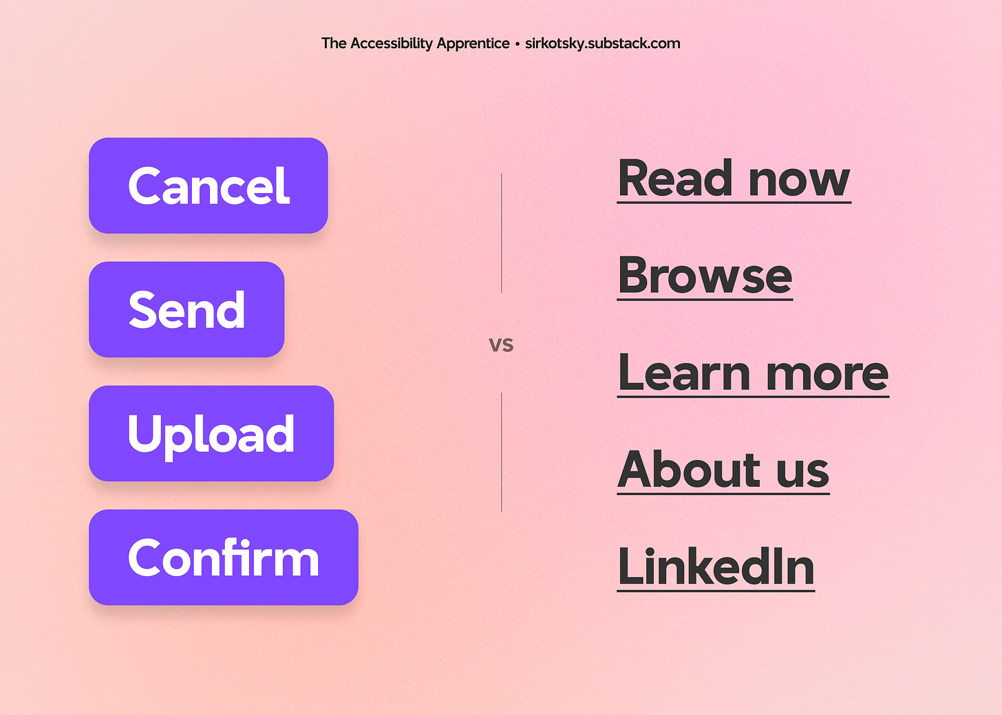
Buttons and links: same but different
How did it happen that two elements, both alike in looks, are actually vastly different from one another, and why you should care
What if I told you that links and buttons were not the same thing? Would your world shatter if I urged you to not only learn the difference, but to be mindful of it when designing your next product? Are you ready to open your mind?
In this short issue of “The Accessibility Apprentice”, we will learn the difference between buttons and links, and why designers should care.
This issue consists of ~830 words and will take ~3 minutes to read.
This newsletter remains free thanks to the power of will and passion for accessibility. You can support the author by buying him a cup of coffee.
tl;dr
Buttons are for actions, links are for directions. This impacts the UX, especially for screen reader users. Designers and developers should know which one to use and when.
Let’s unpack it
Links
A semantic <a> tag has existed since the dawn of times. A short trivia: “a” stands for “anchor” since the very first HTML specification.
Links are designed to take the user away from the current page: whether by opening a new URL in the same tab, a new tab, or even a new window. Developers can specify if the target tab will be in focus upon opening, or style a previously visited link differently to signal to the user that they had already been there.
In short, links are anchors that are tied to some other content.

Buttons
Unlike anchors, buttons a relatively young.
The very first collective of HTML tags did not have buttons at all. Buttons make their first appearance in the HTML 2 specifications, where we find 13 mentions of the word — with a caveat.
In HTML 2, the only ways to create a button involved adding an <INPUT> field and assigning it a type.
For instance, TYPE=SUBMIT would send the browser a command to submit the form. An input field with TYPE=RESET signals to revert the form to its initial state. Finally, an input field could become a radio button (TYPE=RADIO), but don’t let the name confuse you: these are technically just a metaphorical representation of the binary choice.
Buttons as distinct semantic elements appear in HTML 4 (published in 1997), not replacing the input fields with assigned button roles, but expanding them. Buttons allowed users to add images and other content to them, enriching the UI of otherwise bland form elements. HTML 4 also featured a reminder that alternative text was mandatory for all images:
Recall that authors must provide alternate text for an IMG element.
Either way, much like buttons in the real world, their digital counterparts were designed to send messages to the system, whether by submitting a form or asking the browser to perform an action.
Why does it even matter?
Knowing which element to use helps you design and build more accessible products.
You see, screen readers announce the type of content the user is about to interact with. So, when they come across a button, they will let the user know that much.
With links, it gets slightly more complicated. As the Yale’s accessibility guide reminds us, users may choose to “screen” the content of the page by assembling all links in one place.
While screen readers can read a full page to a user, screen reader users may prefer to instead listen to a list of links. In that case, a screen reader may only read the link text and not the surrounding text.
The difference between the interactions is as apparent as the difference between searching for the light switcher in the dark and looking the book up in the library catalogue.
Imagine that, instead, you find a bunch of light flips in the drawer where index cards used to reside.
What should I do?
Learn the difference, communicate it to your team, and use it.
Including a little note in your design system documentation is a good start, and so is facilitating an audit of your website.
Enable a screen reader on your desktop or use an extension like Link Gopher to assemble all links from a page to identify the missing ones. Check the source code of your page (if you know how to do it). Go the extra mile and recruit a screen reader user to test your web pages and identify the problems together.
It may seem like a minor problem, and in the grand scheme of things, it may indeed be insignificant, but small things tend to compound and create big problems.
As a designer, you may not always know what is happening in the code base. It doesn’t mean you shouldn’t take interest in how your solutions get implemented. Besides, now you know where to look.
This newsletter remains free thanks to the power of will and passion for accessibility. You can support the author by buying him a cup of coffee.


