#05. Accessible doesn't mean ugly.
In this issue, we will discuss how accessible products benefit everyone, why accessibility is more than a list of standards and formal requirements, and why accessible and beautiful go hand-in-hand.
This is “The Accessibility Apprentice”, a free accessibility newsletter. If you want to receive more insights, teardowns, and accessibility tips in your email once every other week, consider subscribing.
Let me ask you a question.
Are you wearing spectacles?
Over 75% of adults in the US, according to the Vision Council, use vision correction devices (spectacles, contacts, etc.), so chances are, unless you are incredibly lucky, your vision is at least slightly off.
Thankfully, the stone age is over: glasses are no longer considered a medical appliance. Moreover, they have long become a fashionable accessory, with people making spectacles a part of their identity, matching them to their outfits, looking cool.
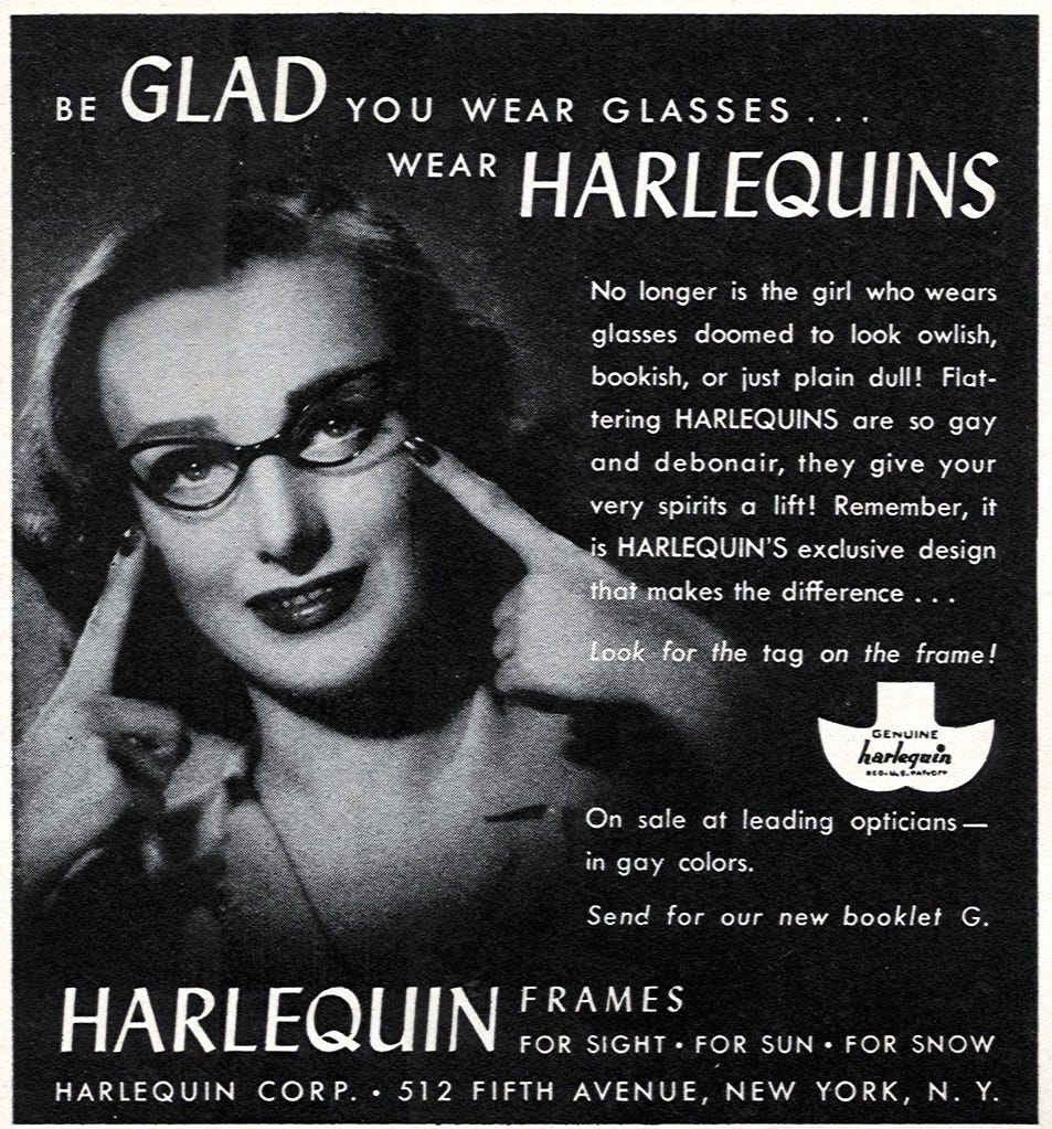
Just a few decades ago, however, things were not quite as sweet for us, spectacle–wearers. Forced to look “owlish”, “bookish”, or “foolish” in our giant, ugly prescription glasses, we would try our best to hide them in public, paint them to match our colour tone, or squint to read street signs or recognise people’s faces.
Glasses are an exceptionally good example of how products can be both accessible and beautiful: or rather, be whatever we want them to be.
There are people who rock heavy glasses and folks who hide their spectacles. The industry has solution for everyone, allowing people to choose the product that fits their preferences, requirements, and identity.
Accessible beauty.
In “Design Meets Disability”, Graham Pullin uses the example of spectacles and prosthetics to demonstrate how accessible products, initially designed as medical appliances, have transformed into fashion accessories of sorts over the years.
Matching a pair of glasses (or a prosthetic limb) to a purse is only bizarre in the world where accessible products resemble Middle Ages’ torture equipment. Good design encompasses aesthetic and usefulness without neglecting either.

There are plenty of creative ways to design flexible and accessible products, and a huge untapped market for it. In the physical world, the shift towards embracing disabilities and celebrating diversity manifests slower than in the digital realm.
Break stuff.
Accessibility is built into the majority, if not all, digital standards. Mozilla’s Accessibility Guide highlights:
A great deal of web content can be made accessible just by making sure the correct Hypertext Markup Language elements are used for the correct purpose at all times.
Many of these standards have existed since the beginning. Designers and engineers have been ignoring, neglecting, and breaking these standards since then. We have been abusing the flexibility of technology by overusing <div>, placing light–grey text over white background, and autoplaying background videos.
“How to remove a focus state” from almost 10 years ago has over 500K views and 351 upvotes on StackOverflow, with tens of people providing ways to alter the built-in behaviour for the sake of appearance. Many, fortunately, highlight the accessibility concerns. This leads to standards appearing over existing standards: for instance, :focus-visible is an attempt to reconcile functionality and aesthetics.
…all elements, including all links and buttons, had a focus ring applied when focused, which many found ugly. Because of the appearance, some authors removed the user-agent outline focus styles.
But if beauty is aesthetic and usefulness, removing functionality inevitably makes products ugly.
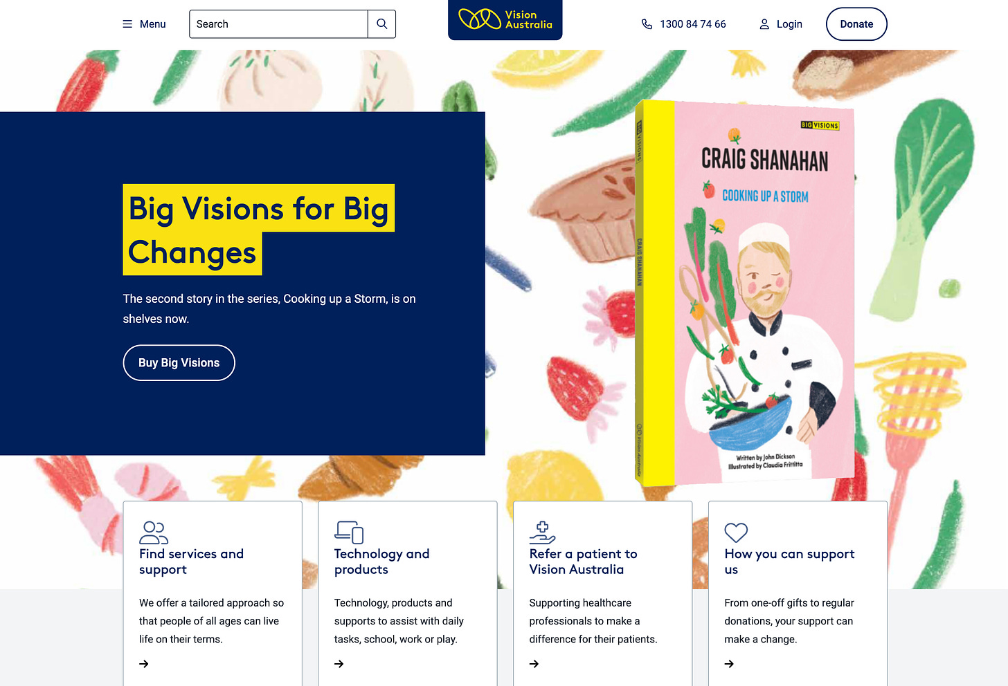
On the other hand, following all AAA requirements does not demand a visual sacrifice — Vision Australia is a great example of a beautiful, functional, and accessible digital product.
In a nutshell, whether they navigate the website with a keyboard, disable JavaScript, rely on a screen reader, or enable a magnifier, each visitor’s experience is not restricted by a broken product.
So what should I do?
Begin with embracing the facts: accessibility is beautiful, universal design benefits everyone, standards exist to make our lives easier.
Today’s world is slowly changing its ways of thinking and learning to accept its diversity. From spectacles and prosthetics to forms and buttons, we strive to standardise the baseline experiences and allow every user to choose how to enjoy their way.
You will find a detailed guide on getting started with accessibility in the previous issue of “The Accessibility Apprentice”.
The future is accessible.


